Categories
Tags
Archives
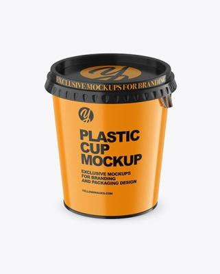
Your Logo Your Vibe Custom Plastic Cups Done Right
-
Posted by Sia Gray Filed in Business #custom printed plastic cups #printed plastic cups #custom plastic cups 90 views

Walk into any high-end fast-casual spot or a boutique coffee house, and the first thing you’ll notice isn't the menu, it’s the hand-feel of the beverage. As someone who has spent the better part of a decade inside fulfillment centers and hovering over thermoforming machines, I can tell you that a logo is only as good as the substrate it sits on.
When we talk about custom plastic cups, most marketing teams jump straight to the Pantone colors. They want that "Instagrammable" moment. But after years of managing supply chains and product protection, I’ve learned that "vibe" is a physical experience as much as a visual one. If your cup cracks under the pressure of a lid application or creates condensation that turns a sleeve into mush, your logo doesn't matter. You’ve already lost the customer’s trust.
Material Science: Beyond "Just Plastic"
In the packaging world, we don't just see plastic; we see resins and polymers with distinct personalities. Choosing the right material is the first step in ensuring your brand "vibe" translates to the real world.
-
PET (Polyethylene Terephthalate): This is the gold standard for clarity. If you are serving colorful smoothies or layered iced lattes, PET is your best friend. It has a high "crack resistance," which is vital for high-volume fulfillment.
-
PP (Polypropylene): This is your workhorse. It’s slightly more translucent (cloudy) but handles heat much better. If your "vibe" is more utilitarian or involves warm-room temperatures, PP is the logistical choice.
-
PLA (Polylactic Acid): The "green" alternative. It looks like PET but behaves differently. It’s compostable, which is a massive selling point, but it’s brittle. I’ve seen entire shipments ruined because they were stored in a warehouse that got too hot PLA will warp at temperatures that PET ignores.
The Professional’s Take: I firmly believe that if you choose a flimsy, low-gauge cup to save $0.02 per unit, you are actively sabotaging your brand. A cup that "bows" when a customer picks it up feels cheap, and by extension, makes your product feel cheap.
The Art of the Print: Registration and Distortions
Printing on a curved, tapered surface isn't like printing on a business card. In the fulfillment world, we deal with "dry offset" or "screen printing" for custom plastic cups.
The biggest mistake I see brands make is trying to be too intricate. Fine lines and tiny serif fonts often get lost in the ink "bleed" during high-speed runs. When we are pushing 50,000 units through a line, the physical vibration of the machinery can cause "registration drift", where the colors don't line up perfectly.
Pro Tip: Keep your design bold. Use the negative space of the cup. A logo that accounts for the taper of the cup will look centered, while a "flat" logo will look like it’s sliding off the bottom.
Fulfillment Realities: The Supply Chain Headache
People think packaging ends once the cups are printed. As a consultant, I know that’s where the real work begins. Your custom plastic cups need to survive the "last mile."
-
Case Pack Optimization: Most brands overlook how many cups are in a sleeve. If they are packed too tightly to save on shipping costs, the bottom cups often arrive scuffed or stuck together (telescoping). This slows down your baristas and frustrates customers.
-
Lid Compatibility: This is the ultimate industry "gotcha." Never buy your cups from one vendor and your lids from another without rigorous testing. Even a 0.5mm difference in the rim diameter can lead to "leakers." In fulfillment, a leaker is a brand killer.
-
Lead Times and Buffer Stock: The resin market is volatile. If you aren't forecasting 3–6 months out, you’re going to end up with generic unbranded cups during your busiest season.
Common Pitfalls: Where Brands Get It Wrong
In my 8 years in the trenches, I’ve noticed a pattern. Brands tend to prioritize the "look" on a computer screen over the "utility" in a customer's hand. Here are the two most common errors:
-
Over-Designing for Social Media: Brands create beautiful, wrap-around designs that look great in a photo but make the cup slippery to hold. If the ink coverage is too high, it changes the friction coefficient of the plastic.
-
Ignoring the "Strap" Factor: If you’re a delivery-heavy business, your custom plastic cups spend 20 minutes in a bike messenger’s bag. If the cup isn't rigid enough to withstand the pressure of a drink carrier, your logo will arrive covered in spilled coffee.
The Sustainability Narrative
We have to address the elephant in the room. Plastic has a PR problem. However, from a life cycle assessment (LCA) standpoint, high-quality custom plastic cups that are properly sorted (like PET) often have a lower carbon footprint in the manufacturing phase than some heavy-duty "eco" alternatives that require massive amounts of water and energy to produce.
If your brand vibe is "Eco-Conscious," don't just slap a "recyclable" logo on there. Actually choose a material that is widely accepted by municipal recycling facilities. Transparency is the new "cool."
Conclusion
Doing custom plastic cups right is a balancing act between aesthetics, polymer science, and logistical grit. It’s about making sure that when a customer holds that drink, they feel the quality before they even take a sip. Your logo is the handshake; the cup quality is the conversation.
Don't let your packaging be an afterthought. Treat it with the same respect you treat your ingredients. Because at the end of the day, a beautiful logo on a collapsed cup isn't a vibe, it’s a liability.
-
Comments